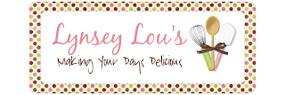
Lynsey contacted me about designing her recipe blog, Lynsey Lou's. She has had a blog for a couple of years of lots of different things, but finally decided to get a great custom design. The main purpose is to share those recipes she has found or created herself.
For the design, she wanted to incorporate her favorite colors pink, green, and brown. She found this adorable design kit by Meghan Mullens, Flavors of Fall. She especially liked the pink damask design, which I incorporated into the sides and background. This kept the design very simplistic.
The header was an important aspect (as it is with every blog!), so I gave her a couple of options to choose from. Ultimately, I was able use the polka dots that incorporated all of the colors as a frame to the title. Lynsey had a few fonts in mind, but we ended up going back and forth until we found JUST the right ones! I think the whole header look makes it look cute and pretty at the same time.
For the sidebars, I wanted to incorporate all of the colors again, but not with the dotted paper. So, I took the colors she used, added a damask pattern to each color, and came up with the different sidebar titles.
She also wanted a clickable button for her amazon store. I figured since it was cooking "hardware", I would try to incorporate those utensils from the header once again. I wanted to make it different from the others also so that readers would know that it is a link, not just a title. I also used a couple of other cooking elements for her signature.


No comments:
Post a Comment